Arava Crossing is a branding concept for an express toll road connecting central Israel with Eilat. Inspired by the desert landscape and the journey south, the visual identity conveys safety, reliability and forward movement.
THE PROBLEM
A long journey south
The drive to Eilat can be long and tiring, especially during busy holiday periods. The brief explores the need for a faster, safer and more continuous connection to the south — and a brand that makes this new road feel clear and trustworthy.
THE VISION
A better connection to Eilat
Envision a modern transport corridor connecting central Israel with Eilat, supported by digital services and traffic management. A journey that feels safer, simpler and more connected to the landscape around it.
THE GOAL
Build trust from the first encounter
Create a recognizable identity for a new express toll road: reliable, efficient and forward-looking, with a distinct connection to the Arava. Translate these values into a consistent language across every brand touchpoint.
COLOR PALETTE
Colors that lead the way
Desert yellow, deep blue and signal red connect the Arava landscape with the movement and clarity of the road.
Desert yellow
#FFB000
The warmth and landscape of the Arava.
Deep blue
#030B6D
Trust, stability and modern infrastructure.
Signal red
#FF0900
Movement, direction and the Red Sea.
TYPOGRAPHY
A distinctive Hebrew voice
A bold brand name and a supporting tagline create a clear, recognizable hierarchy.
חוצה ערבה
תנועה דרומה אל הים האדום
Asimon DL v3 AAA
The brand name: bold, distinctive lettering that gives Arava Crossing its presence.
Shuneet3 Square Bold
The tagline: a compact supporting voice that complements the logo and keeps the message clear.
THE LOGO CONCEPT
A landscape, a journey, a destination
The identity brings together three familiar elements from the journey south.
The mountain
The Arava landscape, simplified into a distinct silhouette.
+The road
Movement and connection, following the journey south.
+The sun
Desert warmth and a destination on the way to the Red Sea.
=Arava Crossing
Three elements. One recognizable identity.
CAMPAIGN POSTS
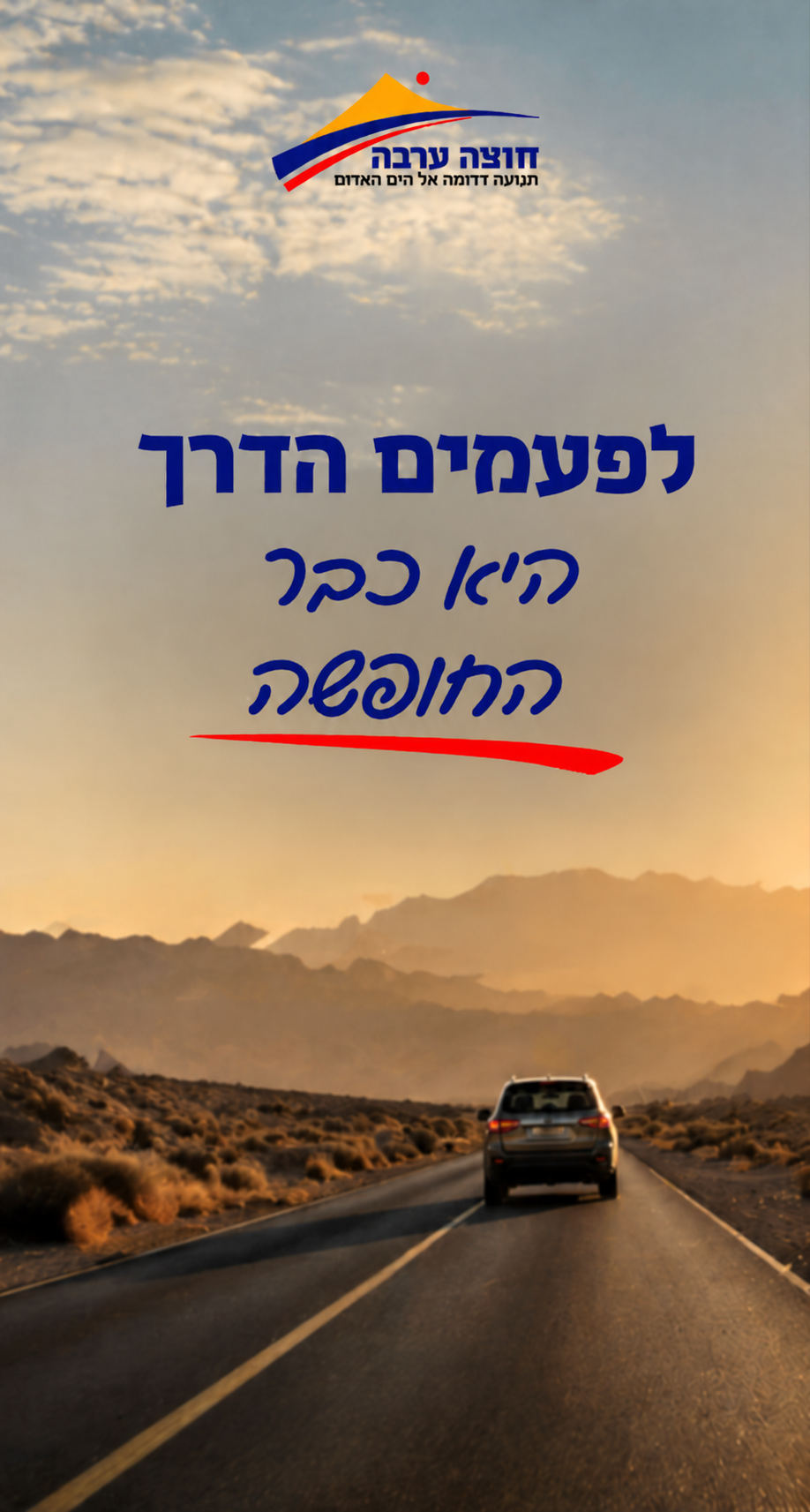
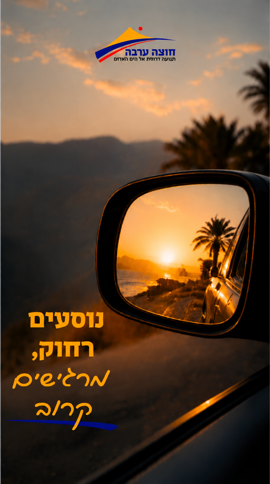
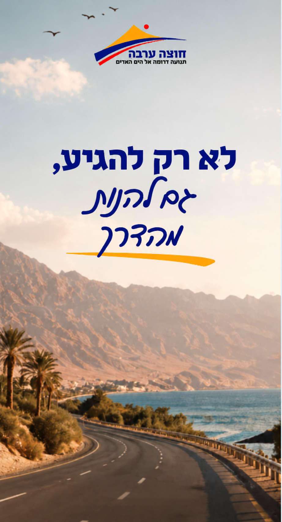
The journey becomes the message
Open roads, desert light and familiar views from the drive south bring the brand story to life. Bold headlines and handwritten accents connect the practical promise of the road with the anticipation of a holiday in Eilat.
הדרך שלך מתחילה כאןנוסעים אל השקטאילת מחכה לך
BRAND MOCKUPS
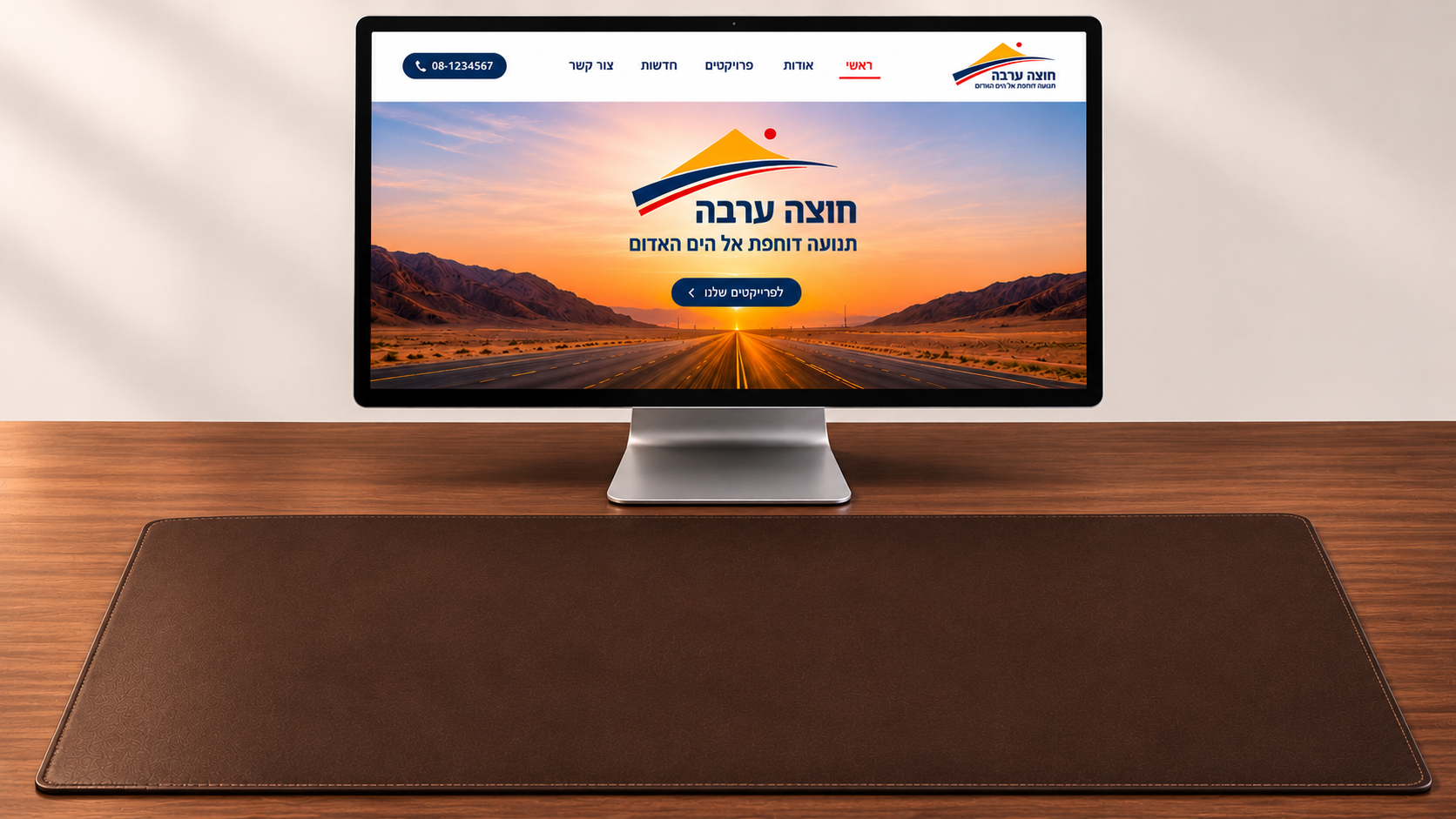
A seat at Arava Crossing
The Arava Crossing identity, brought together on one desk.
Make the desk yours — drag the objects onto the desk and arrange them.
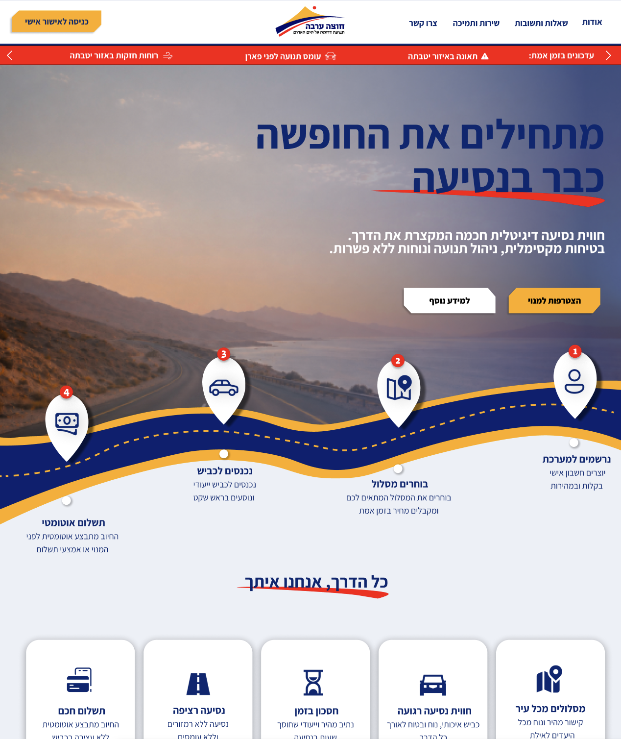
‹
עדכונים בזמן אמת: ⚠ תאונה באזור יטבתה עומס תנועה לפני פארן רוחות חזקות באזור יטבתה עדכונים בזמן אמת: ⚠ תאונה באזור יטבתה עומס תנועה לפני פארן רוחות חזקות באזור יטבתה
›
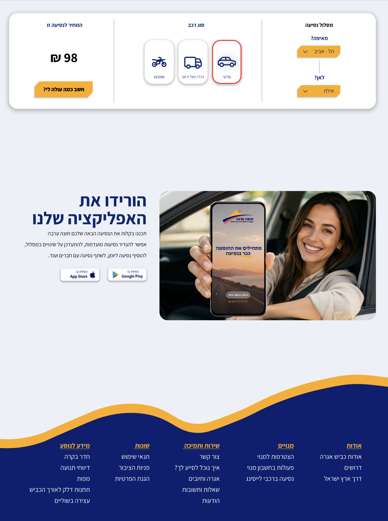
MOBILE APP
The brand, on the move
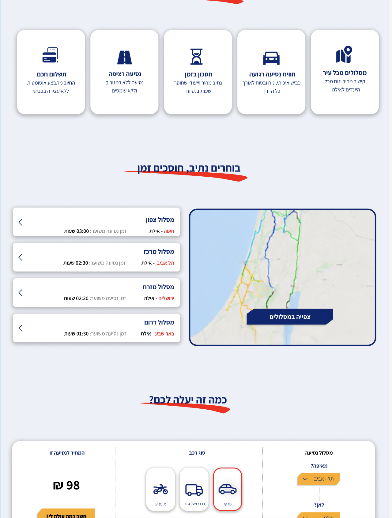
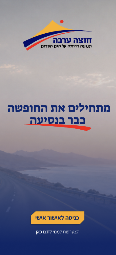
The mobile app brings the same visual language to a smaller screen. Color, typography and graphic elements connect the digital experience with the road’s identity, creating a consistent look across print and digital.